CO2 reduction platform
Responsibilities
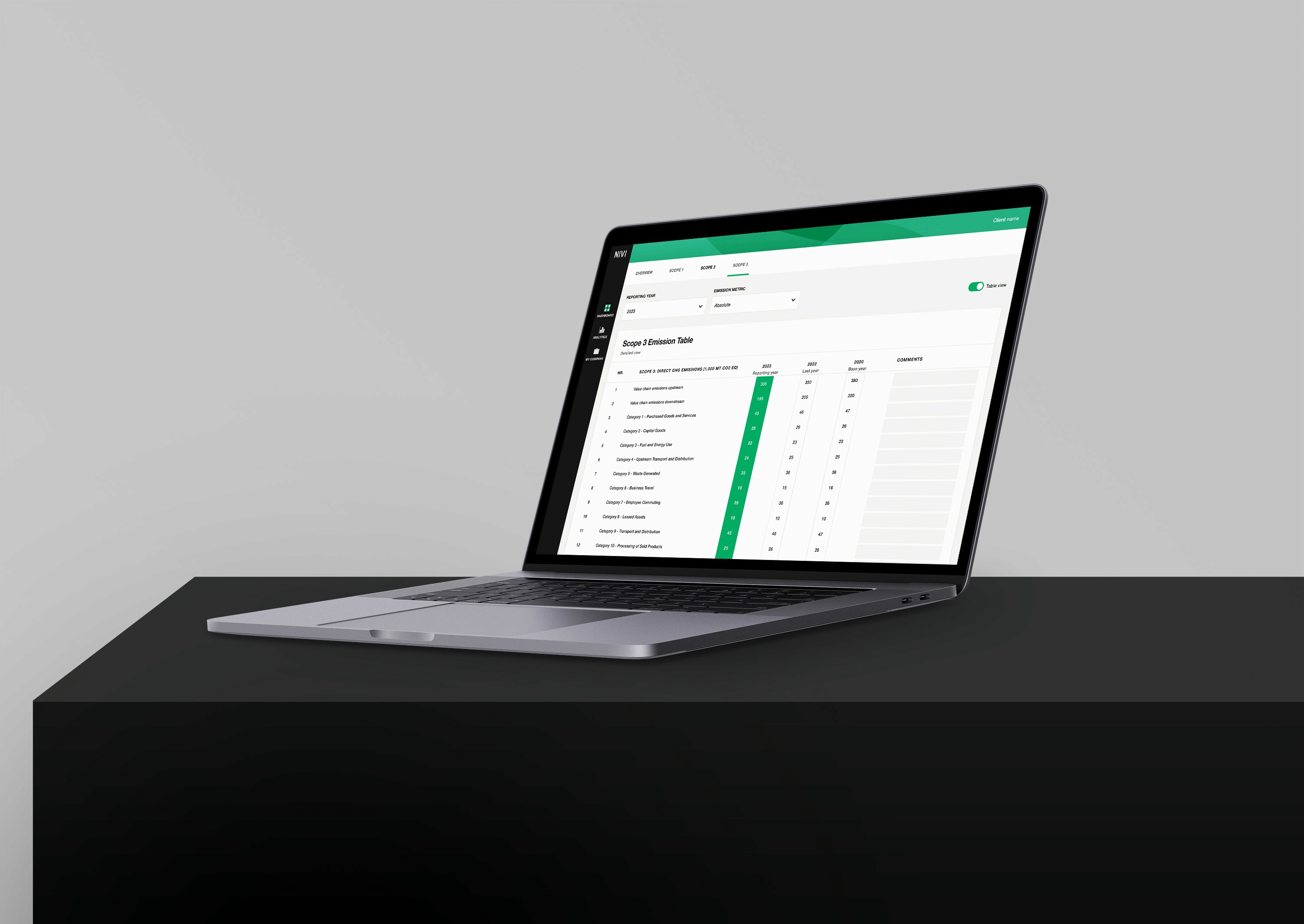
This UI freelance project involved assisting Rune's team in first developing Nivi, a data analytics tool designed to help larger companies reduce carbon emissions and comply with EU regulations before 2030. Following that, the Nivi tool required an informative website to drive new clients. With the team's extensive experience in driving sustainable targets at Mærsk, I contributed UI and web design expertise to ensure we delivered a long-term, user-friendly solution. We worked together for five intensive months online and we will properly do again in the future.
• Conducting competitive research
• In charge of best UI practices
• Decision-making on design system
• Performing web design expertise
• Collaborating with Developer
Problem
With the EU Commission's goal of reducing Co2 emissions by 40% by 2030, the Nivi team identified a need for a practical yet innovative solution to map, quantify and report Co2 emissions. How to turn the data into an analytical tool helping larger companies face the complex challenge of carbon reduction?
Solution
A newly designed data analytics tool was developed in Figma, and the website was launched in WIX Studio after a five months collaboration. It is now published as Nivi digital.
Process
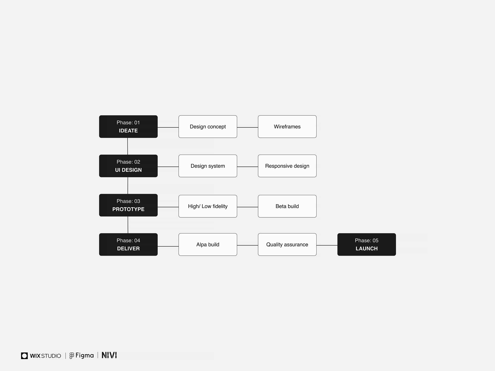
As this project focused on the UI phase, I guided the process through distinct UI stages, based on the UX material provided by Rune.
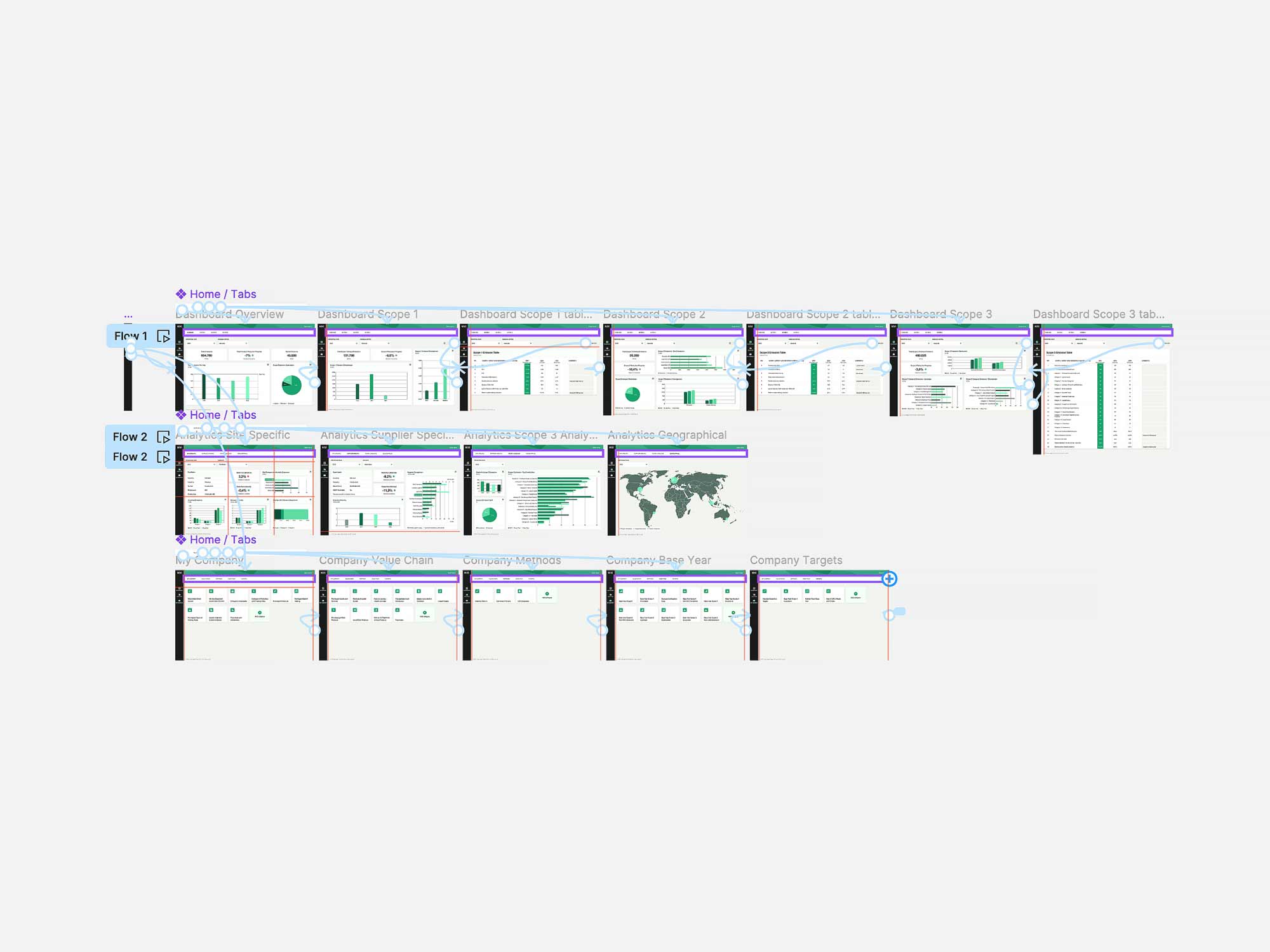
I began with the ideation phase, creating mood boards, then moved on to mockups mockups and design system. Finally, I developed prototypes and completed a full handover to the developer in Figma. Rune and I held online meetings every other week to review progress and ensure alignment between business goals and my ideas.
Design research
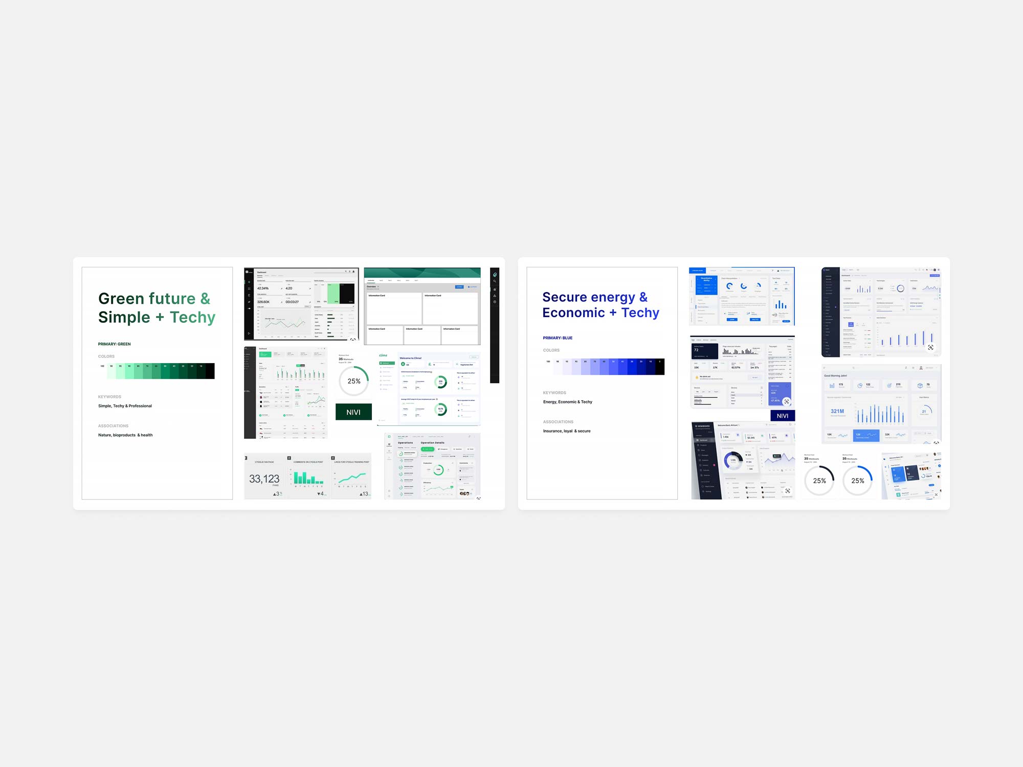
To better understand the setup of CO2 reduction tools and the design direction for Nivi, I researched other Danish competitors in the market. Denmark is known for being a front-runner in green energy, so I focused on major players like Ramboll, Vestas, and Mærsk. From my findings, I proposed two potential directions for Nivi: a "Green Future, Simple & Techy" approach or a blue-themed "Secture Energy, Economic & Techy" design. Since Rune envisions the company leaning towards a green future, we decided to emphasize this by going for green tones, allowing us to differentiate from the larger players who mainly are blue.
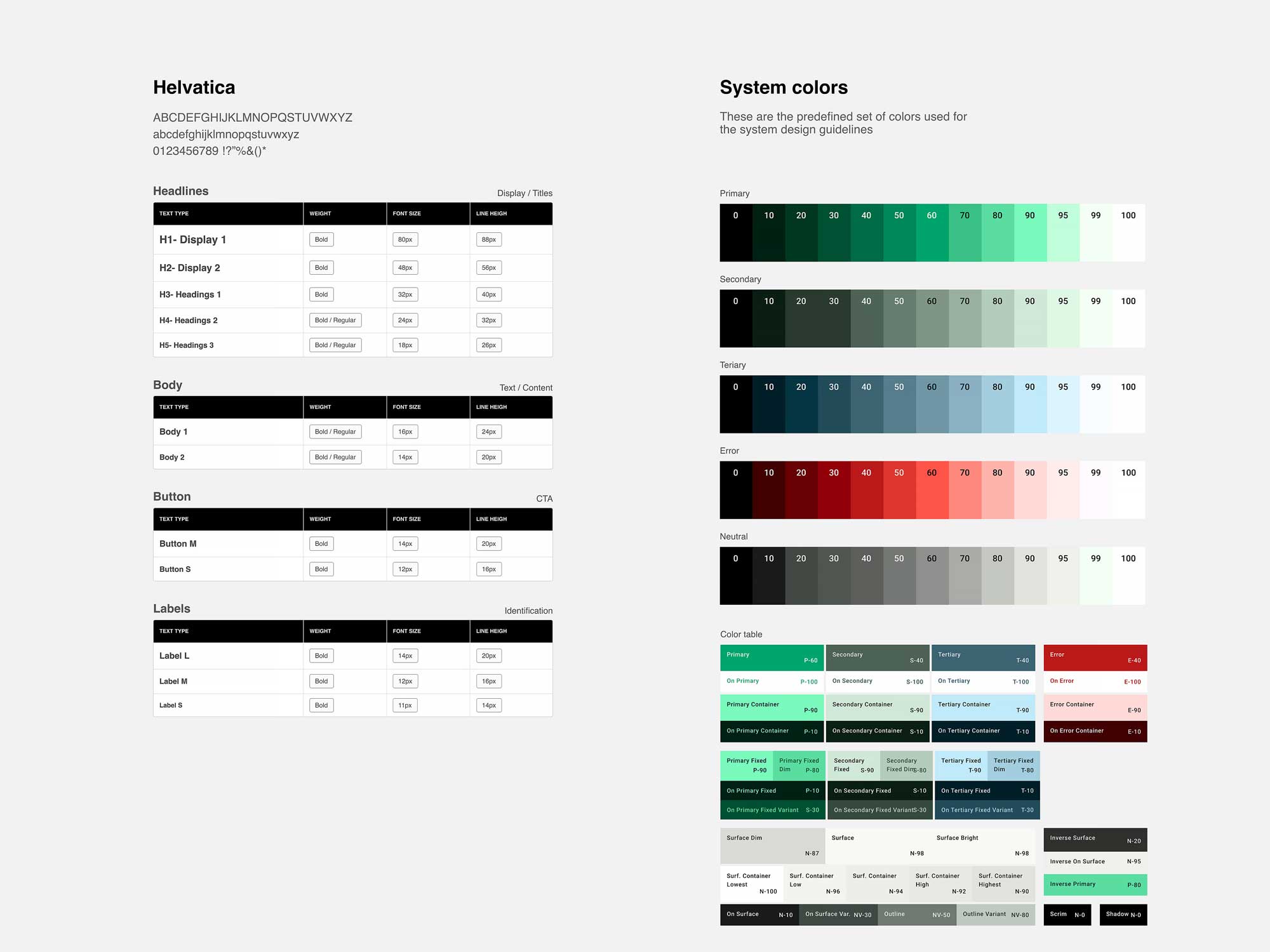
To ensure consistency and efficiency for both myself and the developer, I established a comprehensive color system up front The primary color, green sets the overall tone of the design, reflecting Nivi's "green" identity and is used for primary actions. Additionally, 10 shades of grey were incorporated into the design system to handle text, backgrounds, panels, and controls, which make up a significant part of the UI. To highlight the negative aspects of CO2 emissions, shades of red were included to emphasize destructive states.
For the type system, I went for a safe and popular font that's versatile and easy to work with: Helvetica. Its excellent legibility and range of weights made it an ideal choice, saving me time that would have otherwise been spent selecting a font. I implemented a "major third" scale with a 16px base value for the typography.
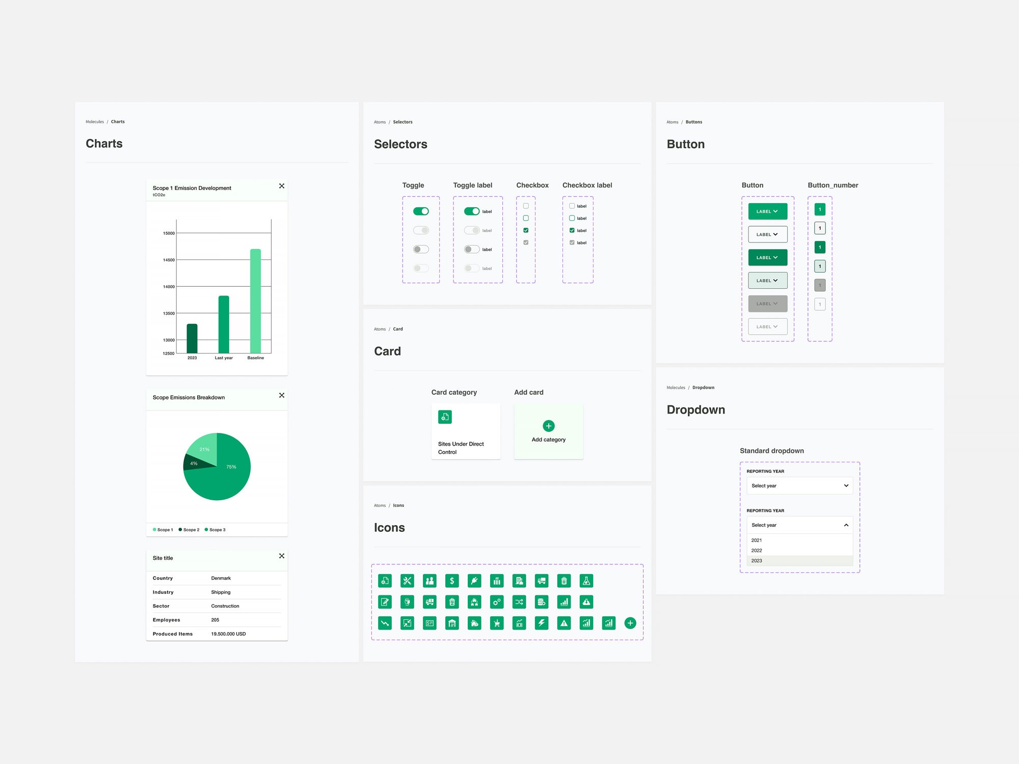
To establish the overall layout of the user interface, I started with these foundational components. While additional reusable components will be added as the project progresses, we focused on the most essential ones due to time constraints. For this specific task, I included elements such as the navigation bar, dropdowns, cards, tables, graphs and pie charts.
To encourage specific user actions, UI principles were used to highlight certain elements. Techniques such as white space, clear titles, explanatory text, shadows, and icons were used to effectively communicate the desired actions.
Rune needed to present the final concept to his business partners before passing it on to the developer. The prototype went through two rounds of validation to ensure the flow and functionality were solid. Although the prototype was relatively simple, it was sufficient to provide a clear idea of how the final product would function.
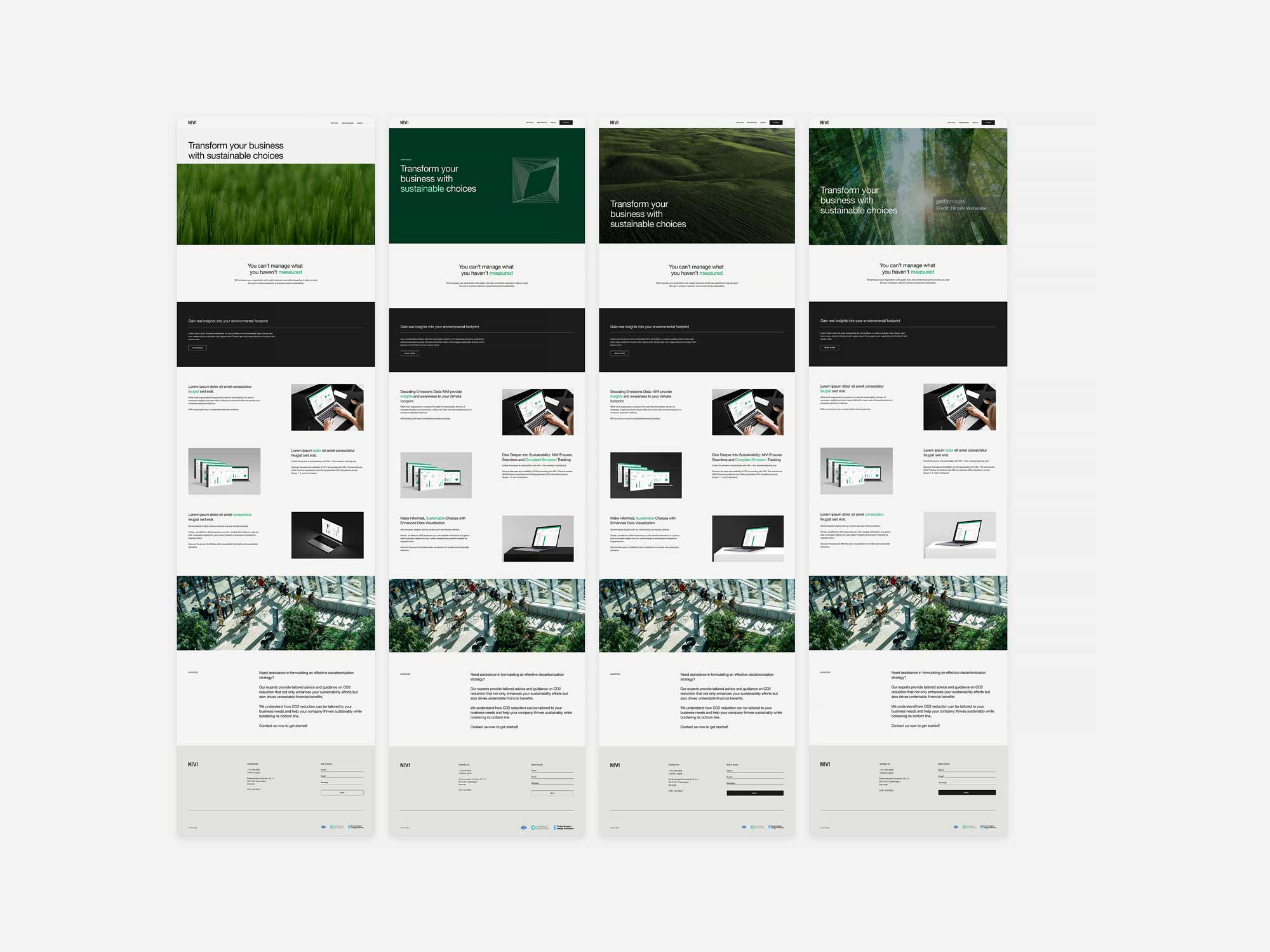
To showcase Nivi's expertise, I developed an informative website aimed at potential clients and partners. This site also serves as the primary access point for logging into the Nivi platform. In the concept, I emphasized the strengths of sustainable business growth by focusing on:
• The green color to highlight important events, we can put attention on green behavior and stay true to the brand.
• By using imagery set up in a futuristic space, does not only highlight the Nivi product itself, but also the the bright future to come.
• By using large informative copy we can tell the story in few words, and quickly introduce the important value proportions.
I built the website in Wix Studio, a comprehensive CMS that supports hosting management systems and can scale with the company. Its intuitive interface is a significant advantage, making the handover smoother for the digital assistant, who can easily add new sections in the future.
You can view the live website on "See website" below.
Please note that the design has evolved since the original version.
Deliver
When I delivered the UI interface design project for Nivi, I had a hand-over meeting with the external developer in Figma and another one with the digital assistant to make a quick introduction to Wix Studio. I continue to follow Nivi's evolution and monitor the progress of the implemented design.
