Extreme Sport Web App
Responsibilities
As the UX/UI designer I was mastering the UX research and performance of UI design. Before digging into the topic I did a short user research with friends, and then went into the design process research, define, design and prototype. It was done as a side project next to my freelance work.
Conducting market research
Decision-making on UX/UI best practice
Identifying new opportunites
Developed UI design sytem
Problem
Extreme Sport content is spread across the internet, popping up in Facebook, Twitter and other social media, but finding a one-platform social network for everybody who is interested in extreme sport is not very accessible.
Solution
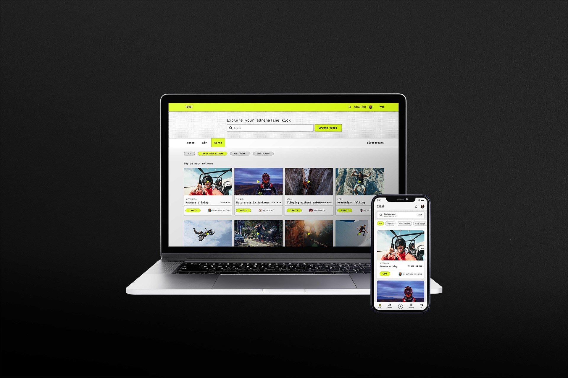
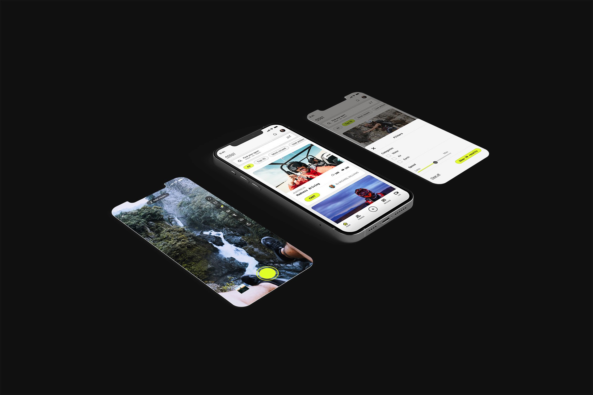
Cepat is a social web app for extreme sport enthusiasts to link up and share experiences through chats and lives streams.
Process
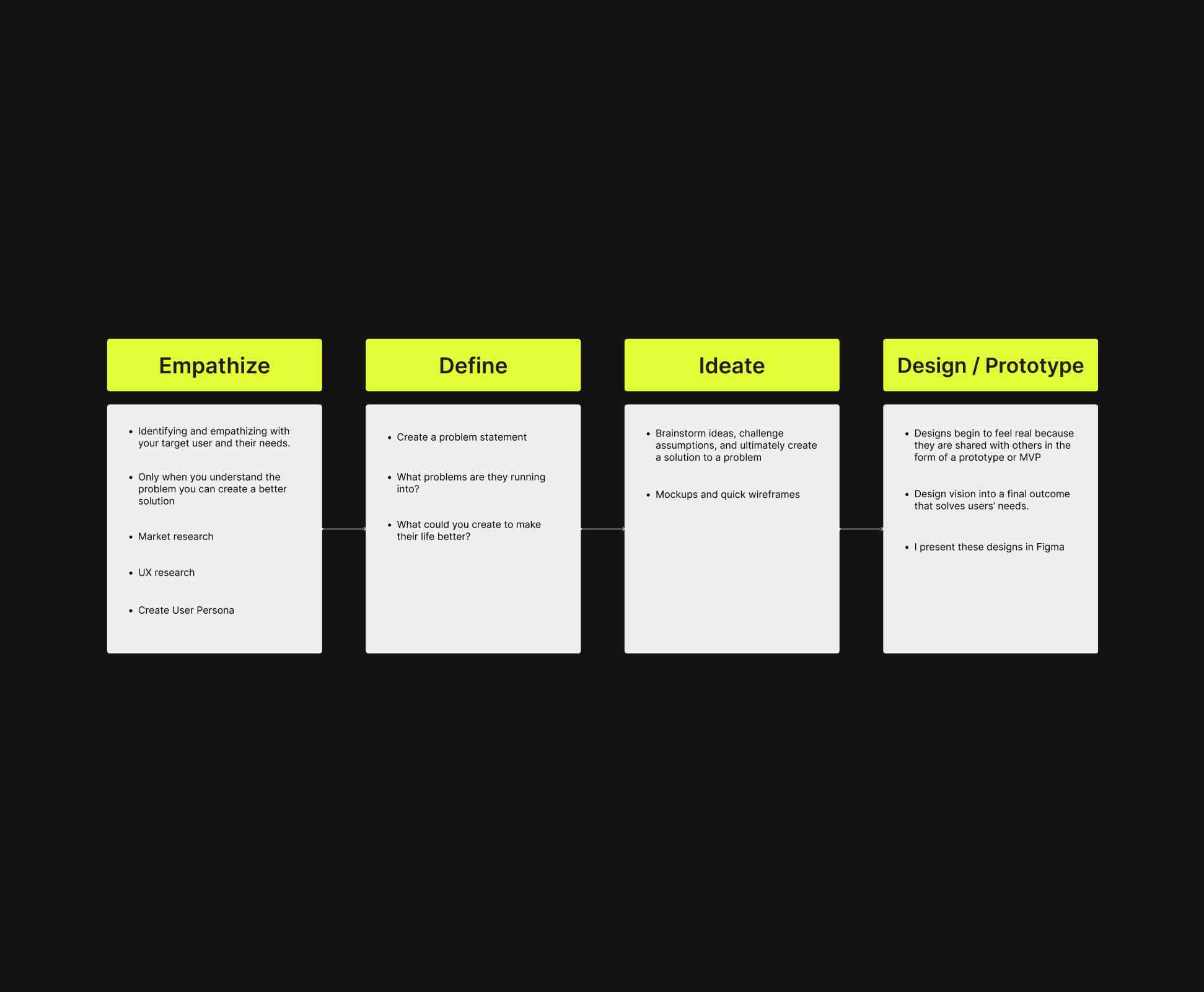
Before building the anything we have to understand the nature of the problem because it will avoid to end up building the wrong thing and to do that I followed this design process: Emphathise- Define- Ideate- Design / Prototype (test). This method is helping me to clarify the problem, user goal and ultimately make a digital service that meets user needs.
Research
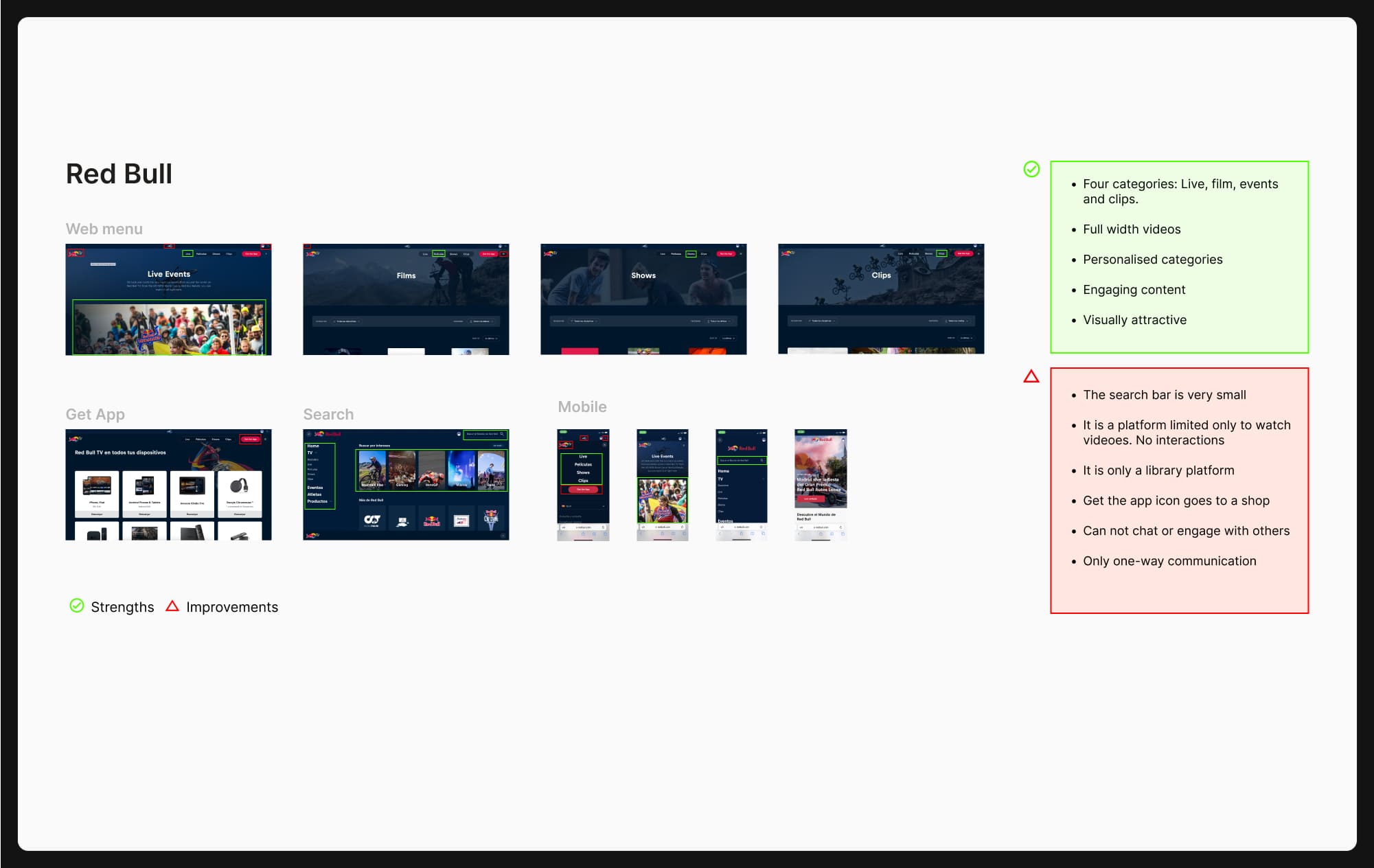
When conducting the UX research the focus was to perform a design critique to identify similar solutions on the market, therefore I performed a benchmark to understand more about the competitors, best practices and user flows.
Competitive analysis
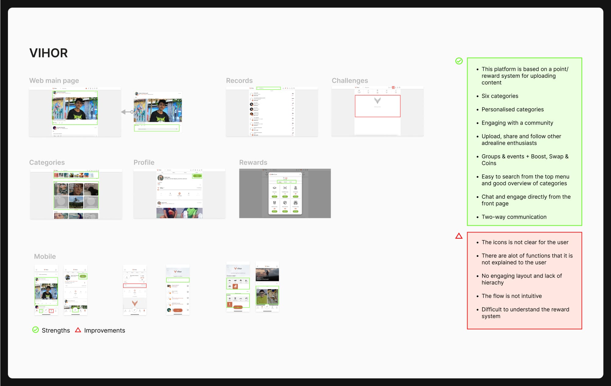
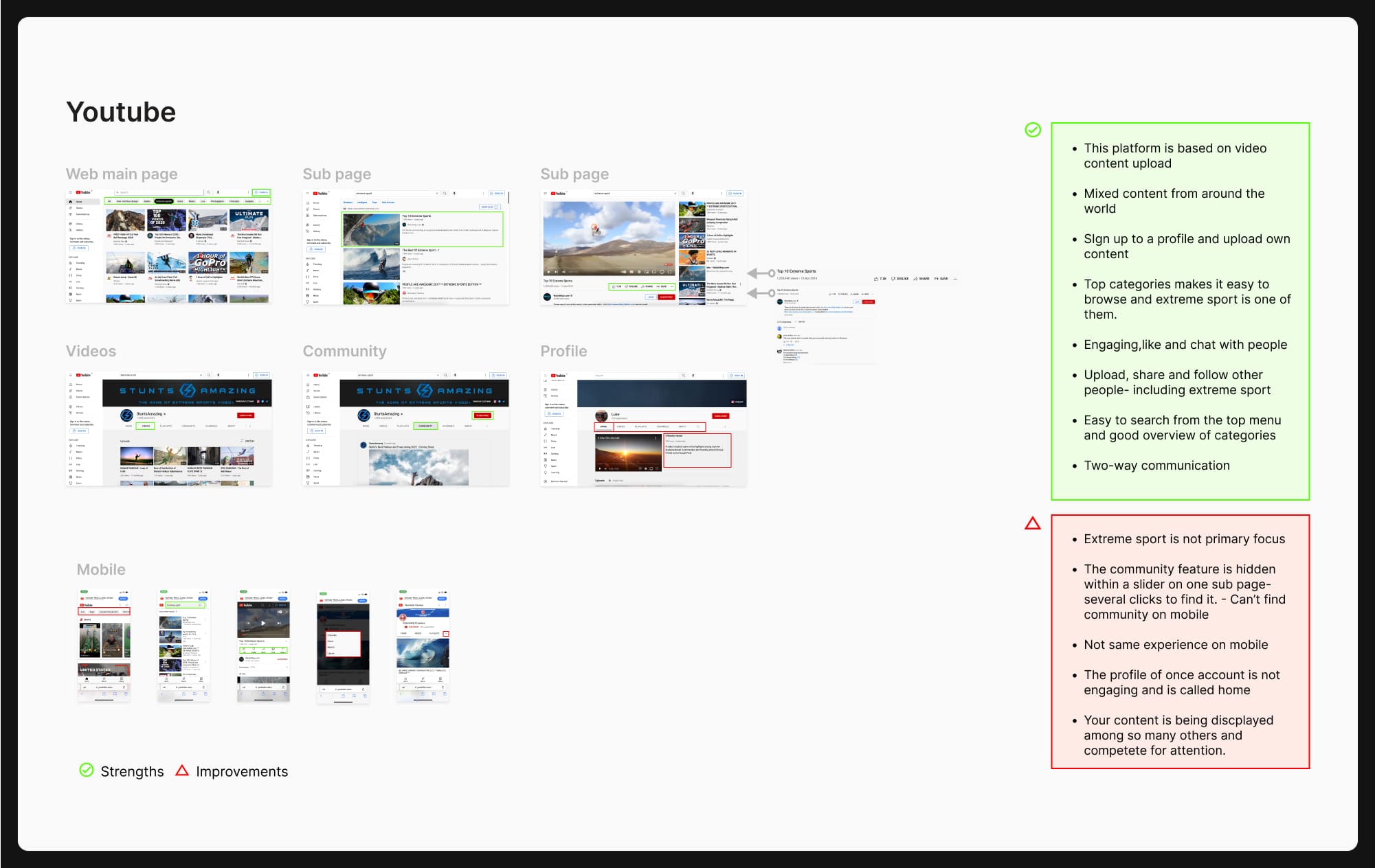
The method included a competitive analysis for categorising and evaluating the direct and indirect competitors to understand and highlight the best practice and evaluate usability issues.
I analysed two extreme sport platforms: Red Bull- sold 7.9 billions from 2011-2020 and front runner for adrenaline enthusiasts, VIHOR- Estimated 290M+ passionate participants in social network for extreme sport athletes and one video content platform, that is being used to upload extreme video content, Youtube, 2.1 Billion Monthly Active YouTube Users Worldwide.
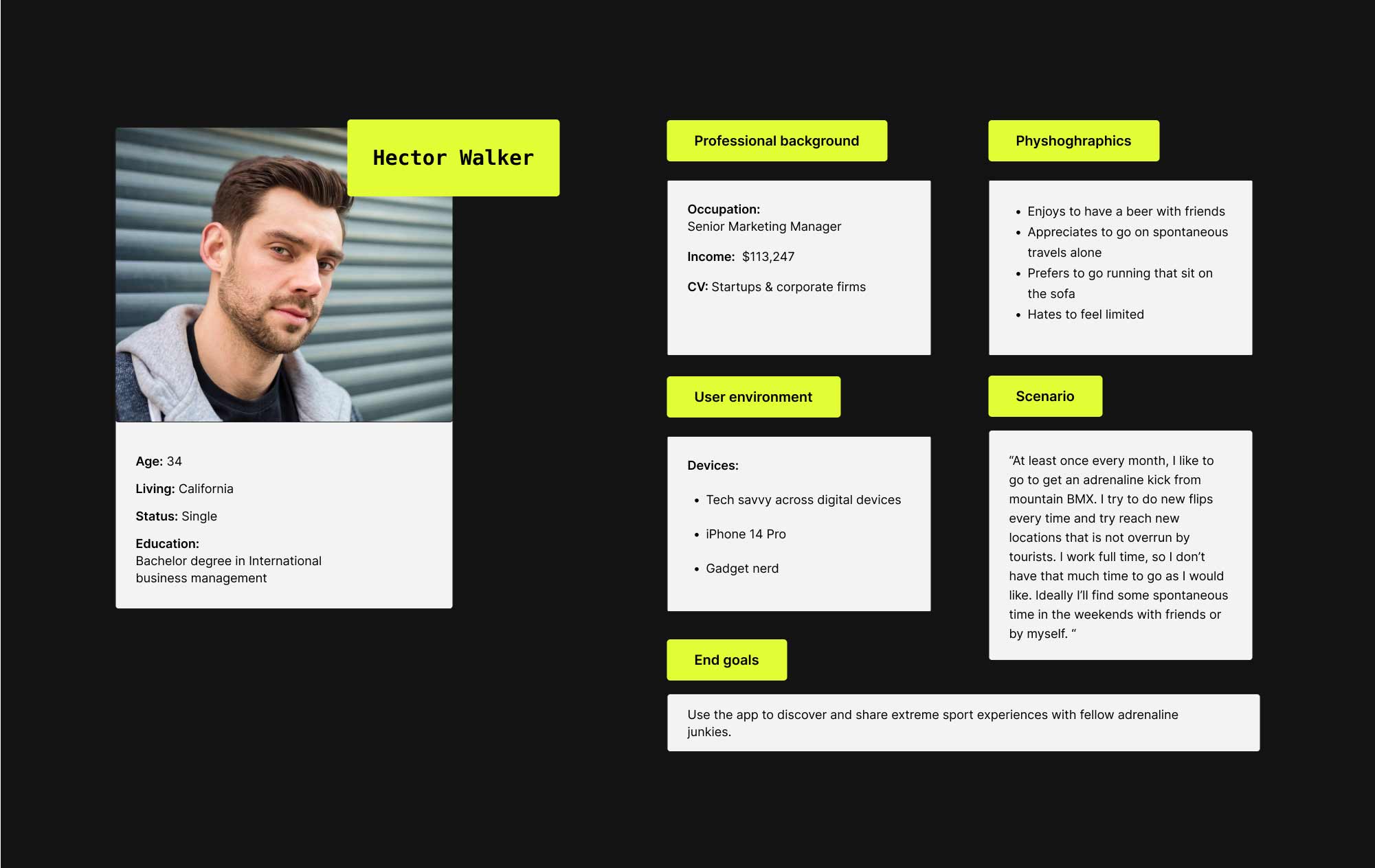
User persona
I asked a couple of my friends who are into some form of extreme sports to conduct research about their user behaviour. I got a good idea of: What behaviour patterns they have? What are their needs and goals and what issues do they face.
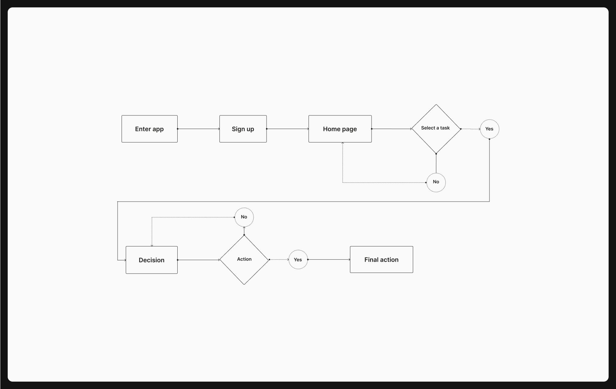
In order to display the path on how a user will act with the Cepat platform, I have mapped out a user flow from entry point to final interaction to successfully upload content.
Wireflow
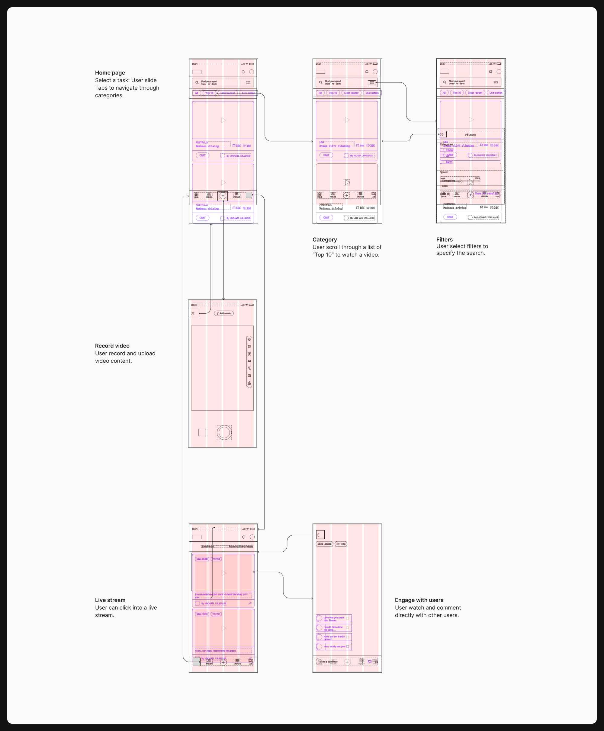
To demonstrate the common user task in a more advanced way than the flowchart, I’ll illustrate in a low-fidelity low-fidelity wireflow.
Mockup
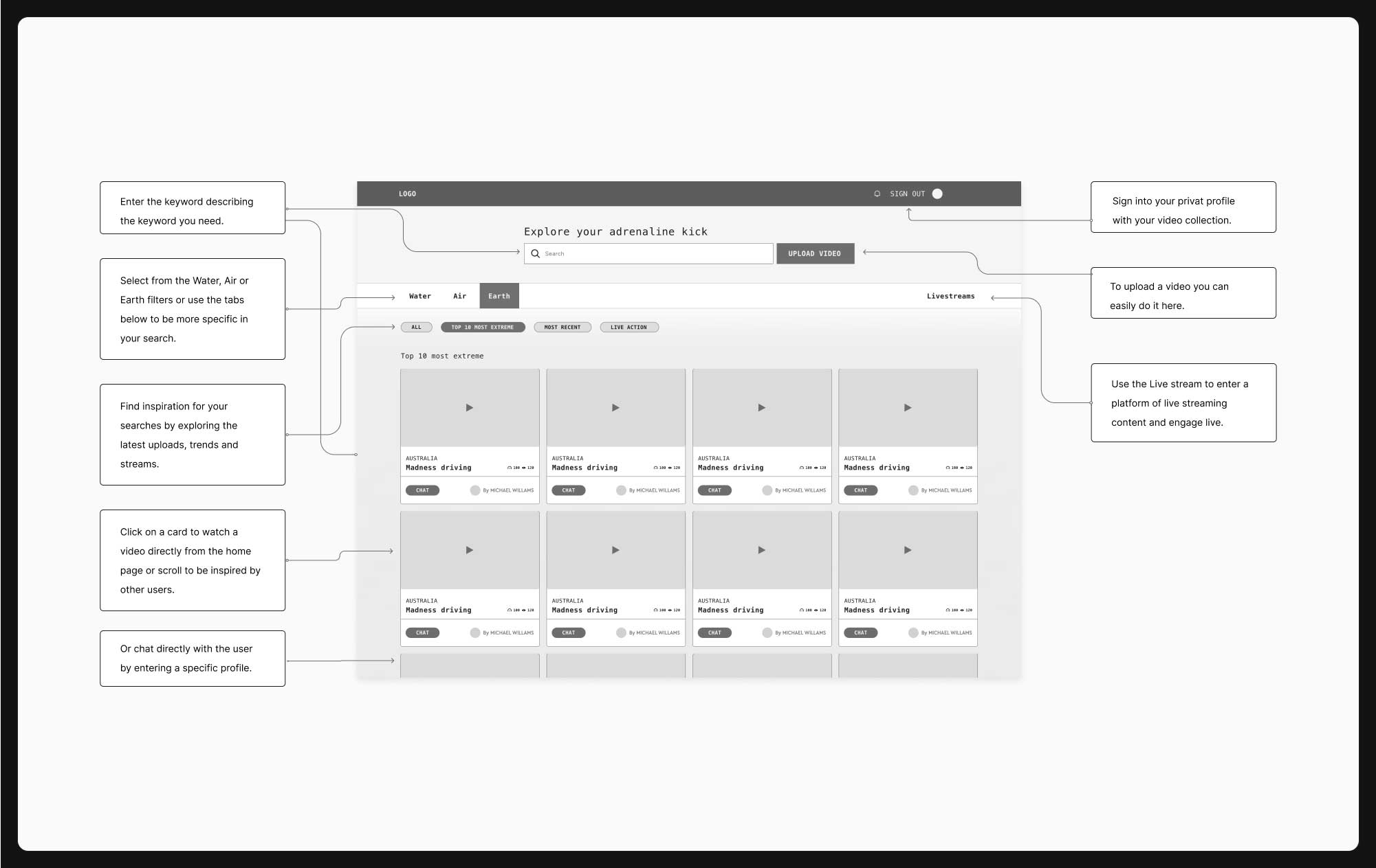
Before going into UI design, I have created the first visual representation (homepage) of the idea with a low-fidelity mockup that clearly describes the functionalities of the platform, for better communicate what the product needs to support.
Design system
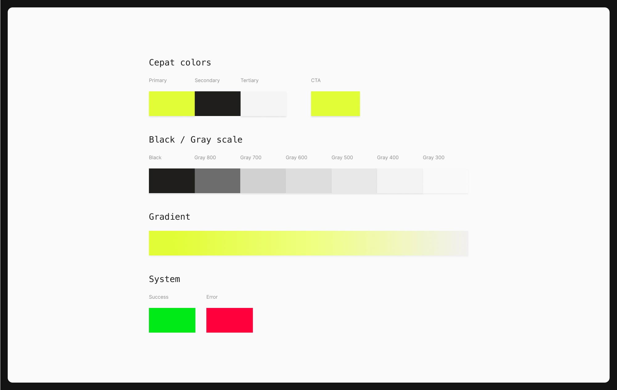
After finishing the user flow and UX wireframes, I started the UI design. Even though the next steps would be to test out the idea which does not necessarily needs a perfect design system the advantage of designing the foundations of a design system already now is to create reusable UI components that can ensure consistency across design files will make the workflow easier and faster for the future. First I layed out the Primary, secondary and tertiary colors highlighting the fast pace of extreme sports.
Typography
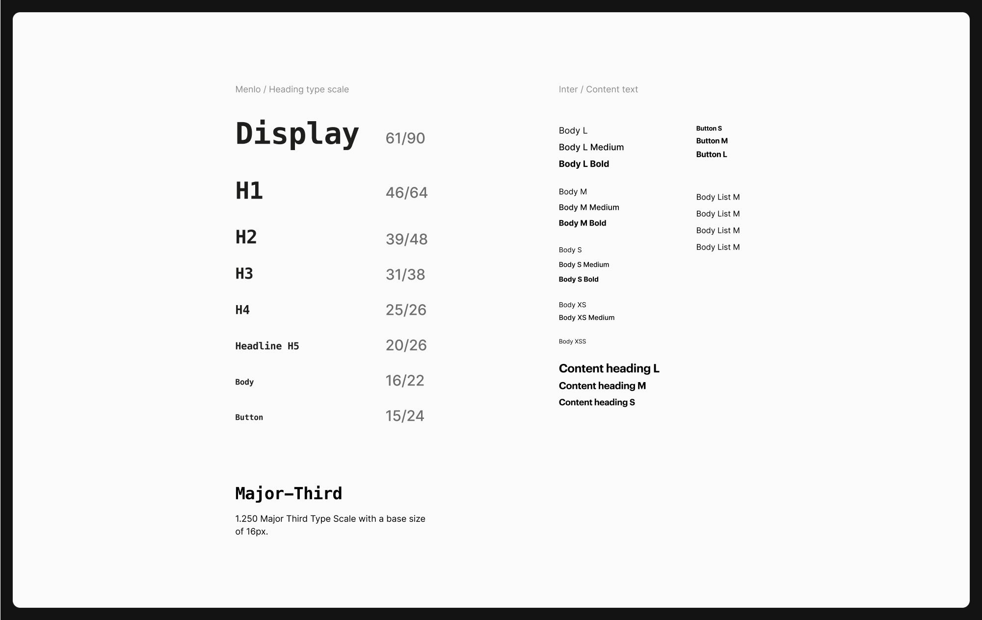
More over to keep text sizes consistent I have used a major-third based typography scale size with 16px as base. I used Figma’s local styles to code in all the styles across web and mobile screens, which makes my work flow a lot faster. I have used two typographies Menlo and Inter for it’s great legibility and tech feel.
UI components
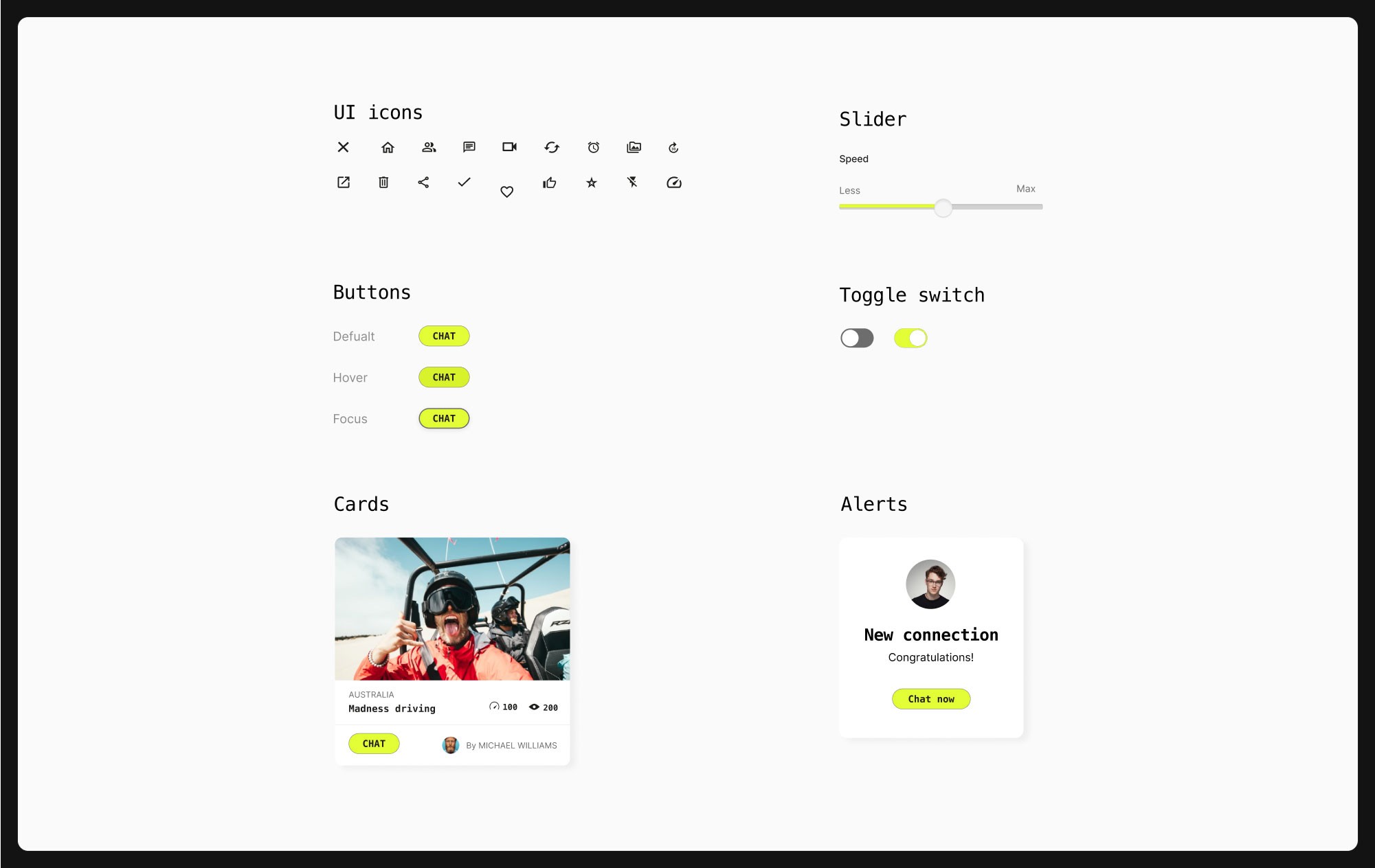
Every-time I created a repeatable component such as buttons, icons, toggle switches, sliders and cards I turned them into reusable Figma components. First I started doing the UI components for mobile, which makes it easier to scale up to tablet and desktop sizes.
Design grid
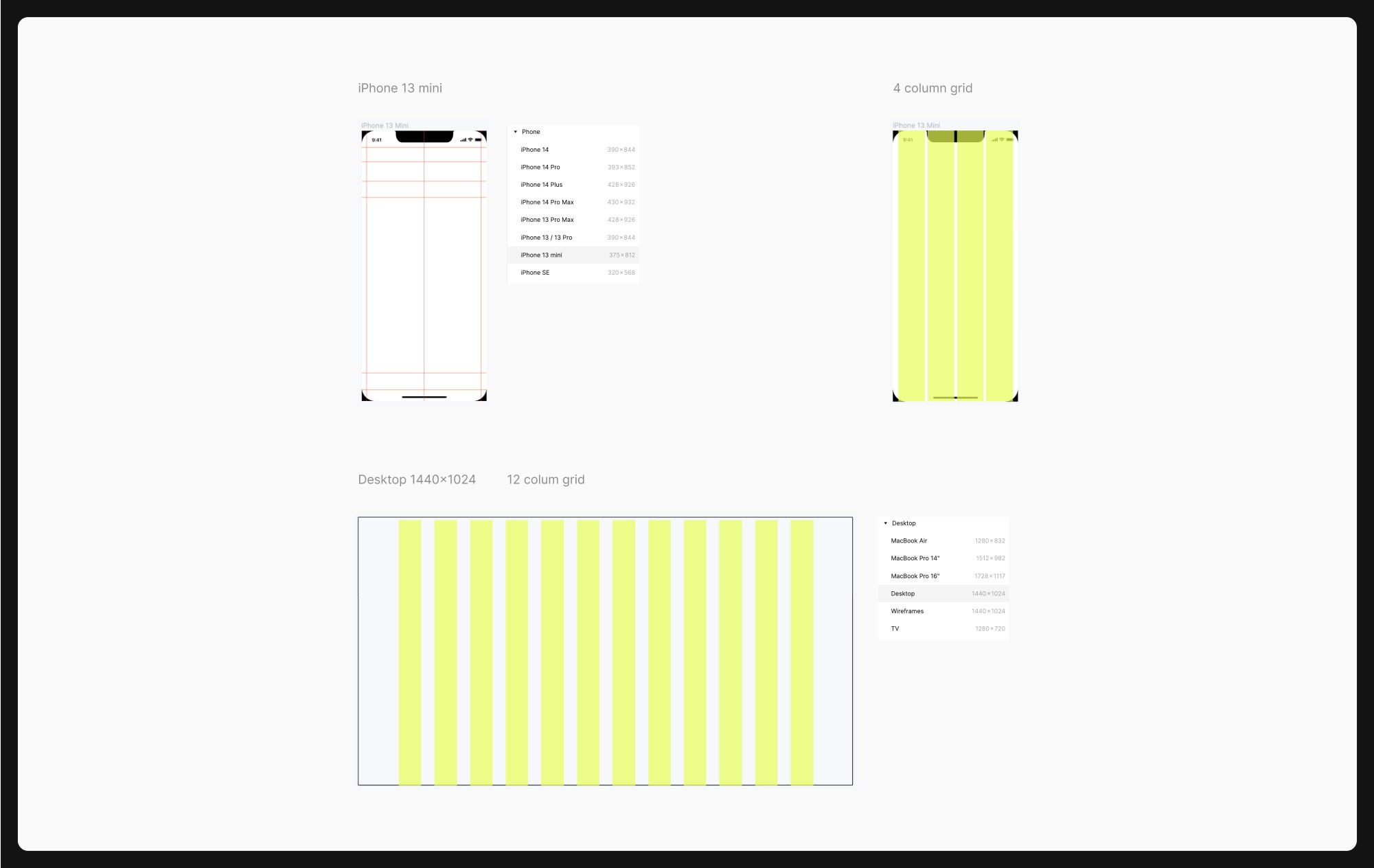
I know grids are very useful to keep the design aligned, though I use it more as guidelines than than a golden rule, because sometimes they can be a limitation for reaching my desired design. Though I typically use a 4 grid, offset 16 for mobile and 12 grid, offset 60 for desktop.
Prototyping
By having a clickable prototype I can easily proceed with usability testing and quick validation of the idea. It will help to improve the quality of the product and identifies issues before getting too far in the design development.
High-fidelity
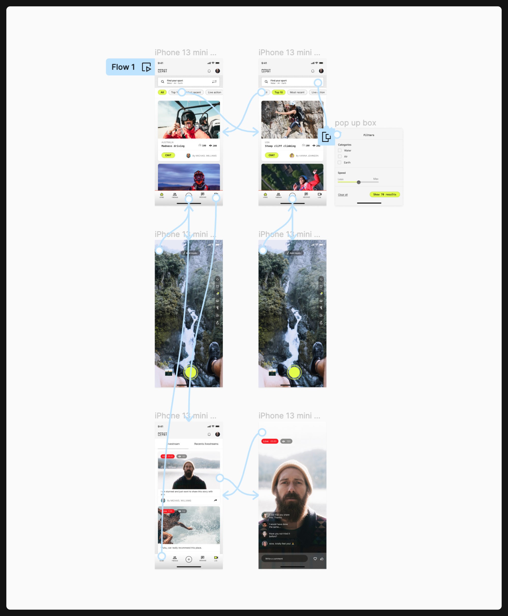
The first test flow of the higher-fidelity prototype is shown below. I have used Figma’s auto animate interactions to better illustrate the user experience as final product.
Reflection
This project is highlighting the importance of UX process before designing. There is not such thing such as a perfect design process, and this one has areas for improvement, but by clearly defining the design scope and user goals, have helped me achieving a favourable testable high-fidelity mockup. Next step would be to do user testing and make corrections based on the user and developers feedback.
